Anyways, if you would actually like to know about water and chemical usage dealing with fracking in Ohio check out the source link.
[Fractracker]
|
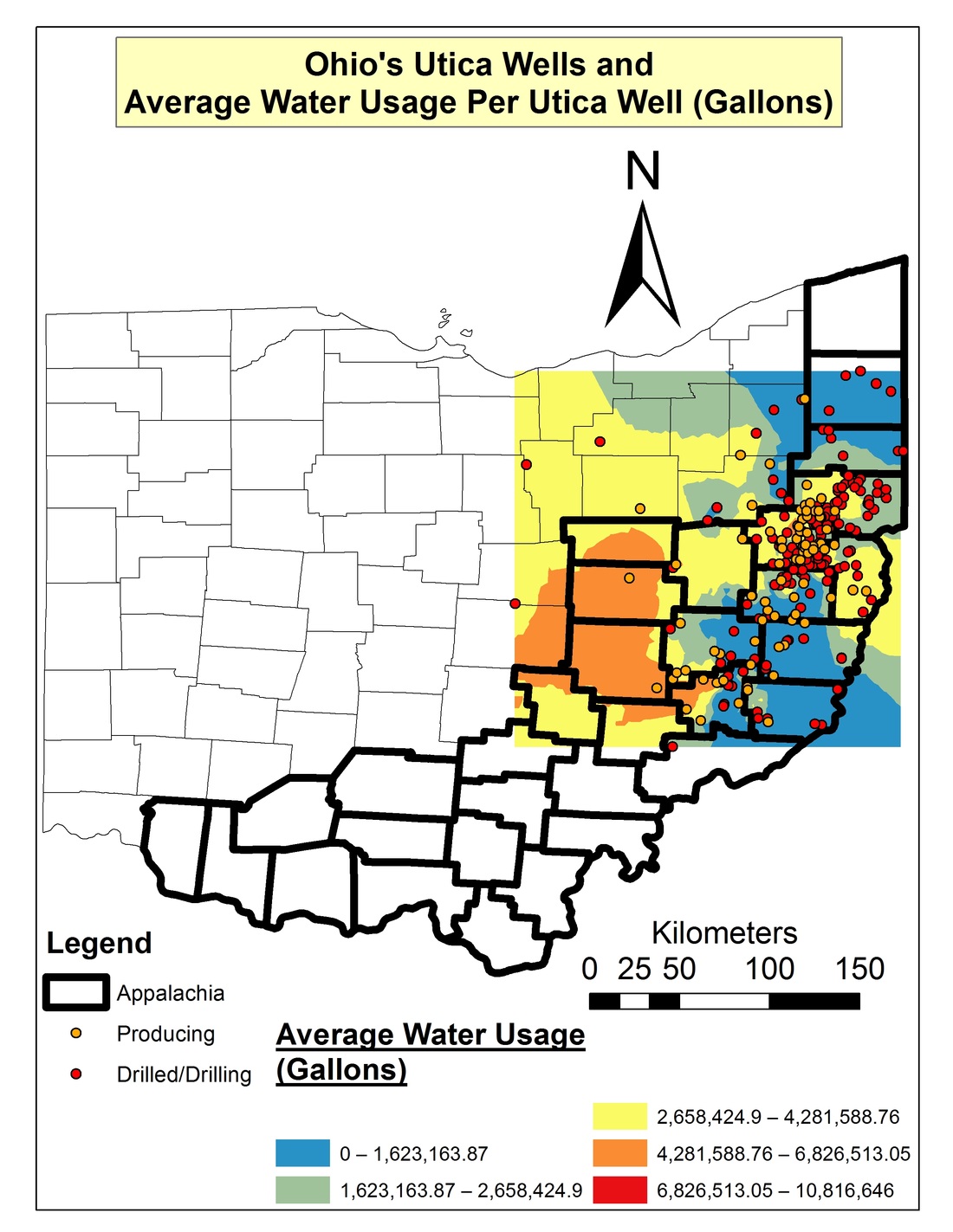
I was looking at this map of water usage by frackers in Ohio and was thinking about my times in early cartography class. I wanted to throw this out to the people that check out this blog and see what you think about it; Do you think it is well made? Where is the source information? Why do I find it hard to read? Am I losing my mind?
Anyways, if you would actually like to know about water and chemical usage dealing with fracking in Ohio check out the source link. [Fractracker]
0 Comments
By: The Male Cheerleader Above is the cartogram for China's population centers. If you are interested in seeing the same visualizations for other countries go to the source link!
[via www.worldpopulationatlas.org] By: The Male Cheerleader This cartogram is an overlay of population density and earthquake frequency, if you are interested in learning more check out the source link.
Map image is copyright SASI Research Group (University of Sheffield) CC BY-NC-ND 3.0. [via maptd] By: The Male Cheerleader Read more about the about cartogram sequence and watch and animation by hitting the source link below!
[via http://www.ccs.neu.edu/home/amislove/twittermood/] By: The Male Cheerleader From NPR's It's All Politics Blog By: The Male Cheerleader With much of Europe being fairly far up in the hemisphere they will experience significant changes due to climate change. The European Environment Agency realized this and has created a series of interactive maps, so read past the break to learn more about the maps.
By: The Male Cheerleader Above is an old school cartogram from the 1930's it is showing the population of the United states, and the green is showing cities with 50,000 or more. Enjoy it!
[via Cartographic Curiosities] By: The Male Cheerleader There is nothing better than a fun way, and interactive way to look at data on a map. Atlas by Collins is an iOS app that I wish was available on Kindle Fire because it looks pretty dang amazing. It is a bit on the pricier end at $9.99, but that may be a small price to pay just to learn a little bit more about the world.
By: The Male Cheerleader From time to time we will show some of our original work from our days in college or from just projects we are working on now for fun. The above image is from a project I worked on for my senior thesis. I was trying to demonstrate the correlation of vineyard location with average temperature, and average precipitation. I am not so sure I was very successful when I look back on it now. What do you think?
|