[via Cartographic Curiosities]
By: The Male Cheerleader 
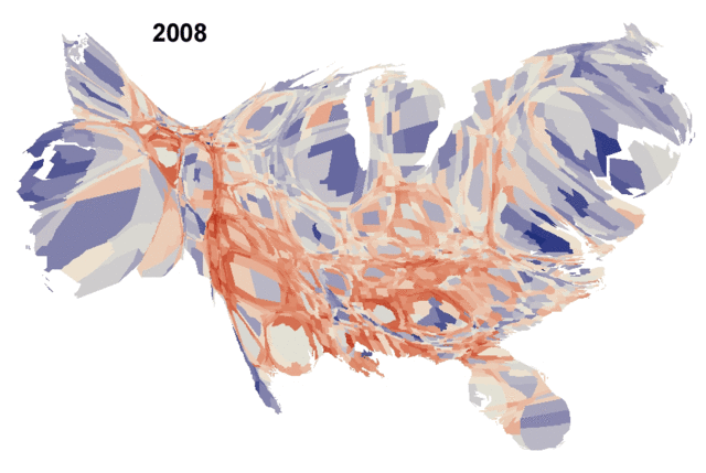
Above is an old school cartogram from the 1930's it is showing the population of the United states, and the green is showing cities with 50,000 or more. Enjoy it!
[via Cartographic Curiosities]
0 Comments
By: The Male Cheerleader Because it is a fall Saturday and Yarbographers love their college football (Go Bearcats!) I decided to post this infograph that was done by Mher Alaverdyan. On his blog he talks a little bit about how he decided to draw it up, but I am not so convinced of his methodology. However, it is fun to look at and think about.
[via Mher Alaverdyan] By: The Male Cheerleader The Northeastern United States relies greatly on surface water for its drinking supplies, and this relies on privately held forests to help maintain a quality water supply. As you can see from the above map, Ohio's surface drinking water is struggling to maintain a high quality. Read more to see what the USDA did to create this map, and to check out a couple more.
By: The Male Cheerleader Yarbographers love cartograms so we are starting a weekly posting of a cartogram just to show our love to these fun visualizations. Above you see a cartogram from the 2008 presidential election, and the counties are weighted by population. Not much more needs to be said, just stare at it and think.
[via Open Left] By: The Male Cheerleader Although these maps are not per capita, but total amount of dollars, it can still be interesting to see what neighborhoods are buying adult Halloween costumes in the Chicago area. Now keep in mind that this is simply dollars spent , so what other ways would Yarbographers want to see this data presented? Check out the interactive map here.
By: The Male Cheerleader The suburbs are possibly the last political frontier that haven't been conquered by any political party. Joel Kotkin argues how the suburbs are the deciding factor in this years election. Read past the break to learn more for a little political yarbography.
By: Cluster This map posted by the National Resources Defense Council's (NRDC) Deron Lovaas points out the counties in the US that burn a crap load of our nations 20% share in the worlds total oil consumption.
By: Cluster I stumbled on this map from floatingsheep.org that depicts, by county, the number of tweets for the keywords "Beer" and "Church" which I personally thought was hilarious since these two things represent my least favorite thing ever, as well as my most favorite thing ever (I will let you folks decide).
By: The Male Cheerleader If you are ever curious as to who was going where, during the last cycle of the census, let this interactive map show you.
|